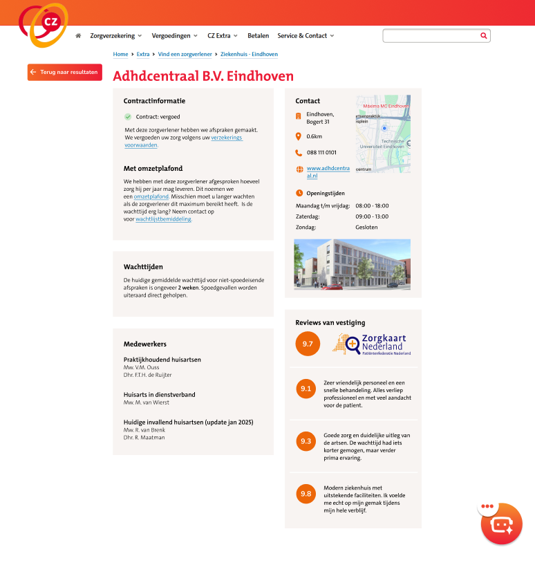
Clients of health insurer CZ seeking mental health support were struggling to find suitable practitioners. The existing ZorgVinder platform was confusing, overly clinical, and hid crucial information, like clinic reviews and waiting times, behind frustrating dropdown menus.
A complete UI/UX redesign of the ZorgVinder platform, transforming it into an empathetic, accessible, and intuitive guide. I redesigned the flow to help vulnerable users find the right care faster, with added support for urgent mental health problems.
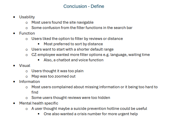
Before designing anything, I needed to understand why the current platform was failing its users. I conducted competitor benchmarking and ran initial user tests on the existing CZ website.
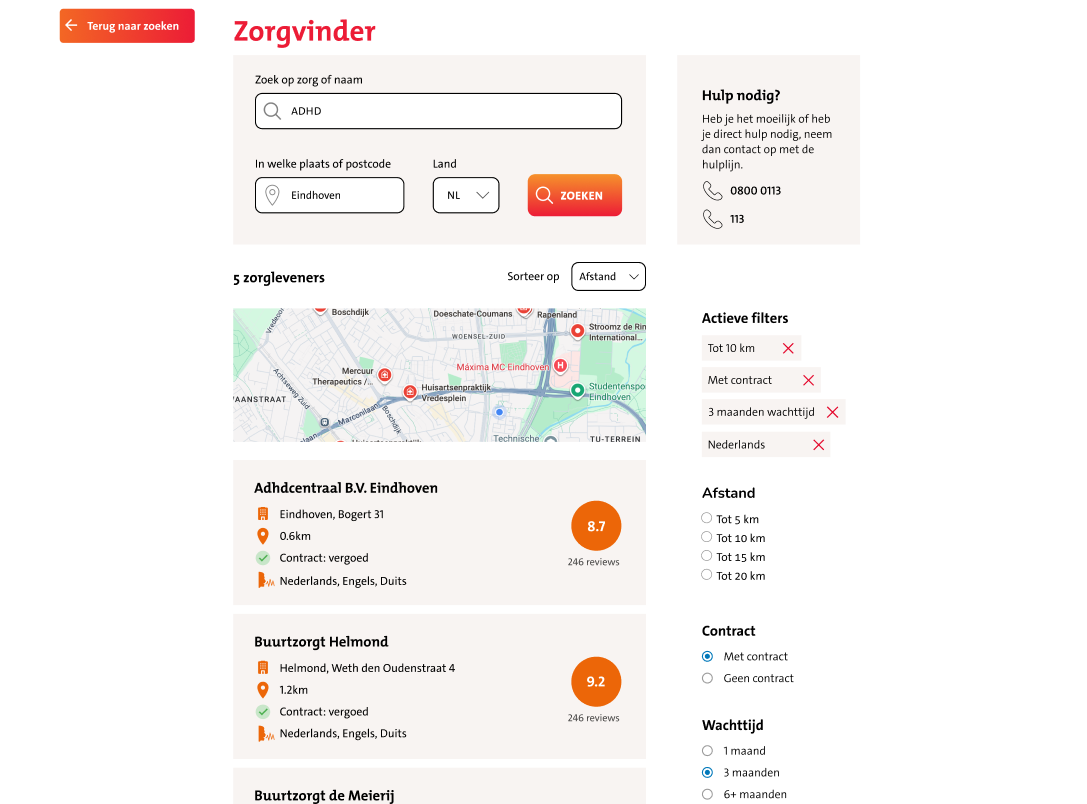
After knowing more about what needed to be changed, I moved into Figma. My goal was to have users find help without needing to struggle with the UI.
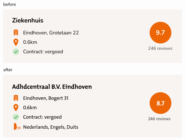
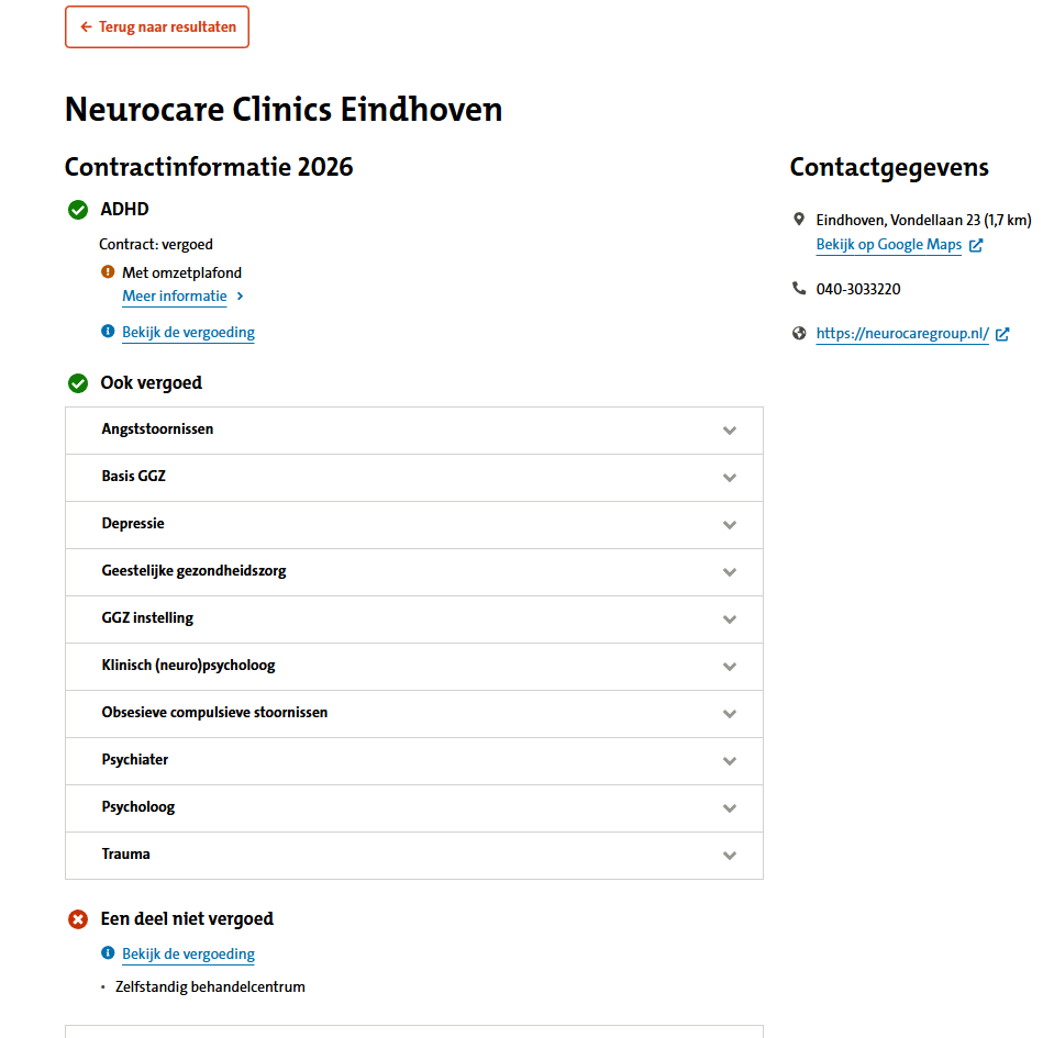 My design on clinic information
A core part of this project was continuous testing. The final design wasn't just my initial concept — it was strictly shaped by multiple rounds of user feedback.
This project reinforced that good UX isn't just about making things look modern, it's about empathy. By listening to how actual users navigated their stress and confusion, I was able to transform a frustrating search function into a more accessible tool for people who truly need it.
CZ was also very happy with the designs and the research and testing that my group did, which resulted in them saying it was the best out of the whole class.